Much has been said about the new instrument panel 7.0 User Interface (UI), but it is actually several UIs, depending if the car is a Classic (pre- Auto-pilot) or it is an Auto-pilot hardware equipped vehicle. We talk a lot about what goes into a UI in our earlier analysis of the Main Screen UI 7.0 Analysis, and won’t bother repeating it here.
First, a few historical screenshots to help keep everything in perspective.
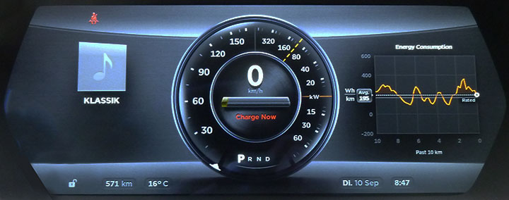
Version 4.5 Instrument Panel, limited power due to low battery SOC
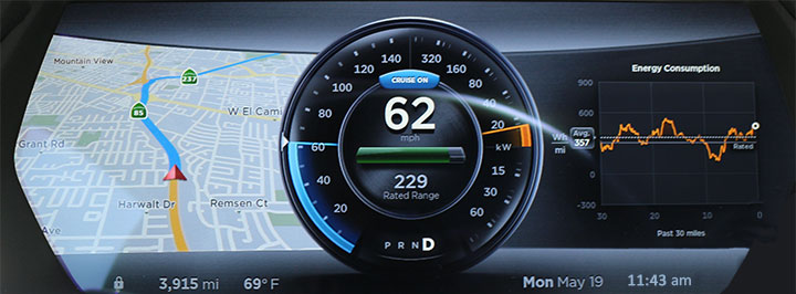
Version 6 Instrument Panel, cruise control active and navigation map
The major change between 4.5 and 6 was the larger fonts for the bottom row and reduced sized font and reduction in brightness of the speedometer and power meter text.
There was quite a bit of debate about how great or poor the new 7.0 UI is. We’re going to really focus on explaining the differences and some of the likely reasoning behind what Tesla did. Here are a few sample screens for the 7.0 (2.7.56) instrument panel:
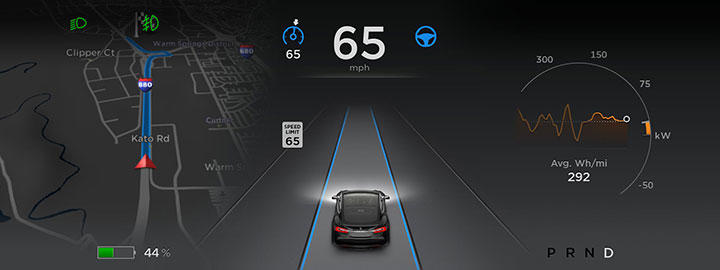
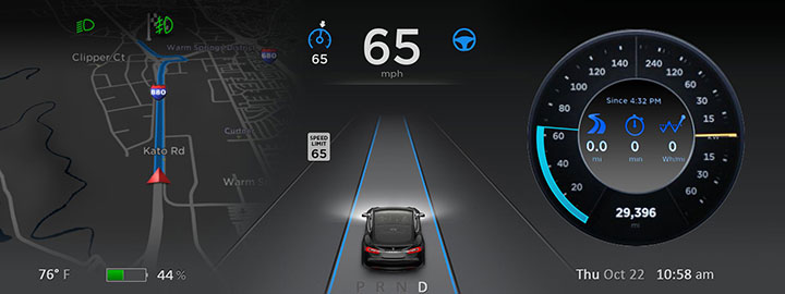
7.0 Instrument Panel, Driving with Self-Steering (cars with AP)
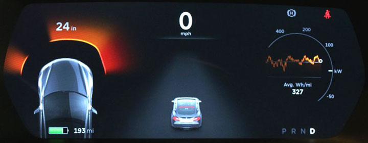
7.0 Instrument Panel, Stopped (cars with AP hardware)
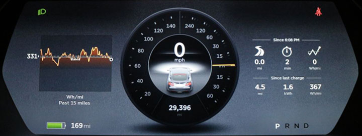
7.0 Instrument Panel (cars without AP hardware)
Similar to the v6 instrument panel, it is broken into three sections, a center speed indicator and selectable side widgets. In some cases, the left widget is overridden by navigation, auto-parallel parking or the parking sensor alarm. The center gets the most dramatic change in cars with AP hardware with a view of the car, lane markings and dramatically improved rear and side blind spot indicators.
While there is some controversy over Tesla’s choice to remove the classic center analog speedometer for AP equipped cars, space is replaced with the 270-degree vehicle perspective. The center now shows:
- A tiny analog speedometer icon with the TACC speed setting below it
- Current digital speed (previously available)
- Auto-steering icon
- Auto-parallel parking available (not shown)
- Rough position of any vehicle in front as detected by the AP system
- The speed limit for this road (previously available)
- Blue confirmation of lane detection on each side of the vehicle
- New side-collision warning indicators
- Clearer Blind spot warning indicators
- Brake lights, blinkers, and headlights on/off visually appear on the car icon
Some items available in the v6 display were moved into different widgets. This includes the time, temperature, instantaneous power indicator, and the odometer. Unfortunately, you can no longer view all these items at the same time, as they reside in three different widgets. In addition, if the left pane is in navigation, parking sensor warning, or parallel parking mode, even fewer items can be seen at the same time.
European version 2.7.77 Adds the temperature and time to the bottom so it is visible at all times (not shown).
The battery capacity and range have both been greatly reduced in size and moved to the bottom, likely to deemphasize their importance. The drive status “P R N D” was moved from the center to the bottom right side and deemphasized
The on AP equipped cars the large analog speedometer has been removed entirely although it remains on non-AP cars. The date was removed entirely. You can no longer view the A and B trip information in a widget. The new trip widget has a new feature to show the time when the car was started, the miles, duration and the power used per mile.
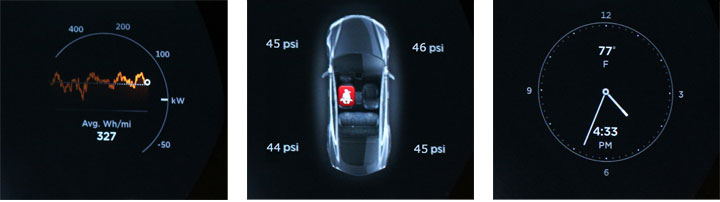
New 7.0 Side Widgets: Energy, Tire pressure and seat-belt warnings, Clock
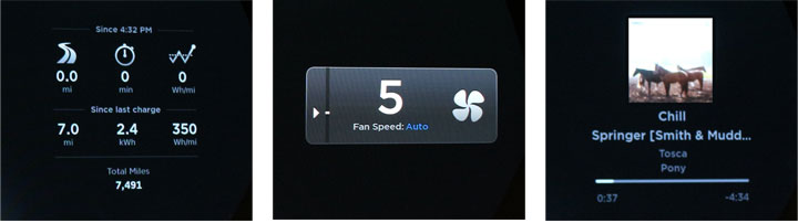
New 7.0 Side Widgets: Trips, Fan (with scroll wheel), Music
Widgets are selectable by holding either side’s scroll wheel in for 2 seconds and scrolling to the desired widget. The new Energy widget is not available on the pre-AP cars, but the old energy widget remains, so there is no loss here. The tire-pressure widget is not available in cars prior to VIN 50900 when the TPMS hardware changed.
While a few owners bemoan the changes, we think the new AP center view is brilliant. Trying to combine all the needed information while Auto-pilot is active into a clear and easily understood display is quite a task. If feels natural without being confusing. I expect other manufacturers will copy the design when they roll out AP features in the future.
Now the new center AP view is less useful if you have the AP hardware but are missing the optional AP software or you turn off AP features. In this case, some owners have asked to revert the Instrument panel to something closer to that shown on Classic cars without AP. This might be problematic as some safety features are still available, like blind-spot warning and side collision warnings. I suspect the percentage of vehicles in this category to be quite small. Perhaps Tesla did not feel it necessary to create a third interface for a few owners. It might also help up-sell the AP software to those owners who originally passed on it.
I’m sure it was quite a trick to maintain as much information as possible while adding a huge amount of new information. I’m not sure the perfect balance was achieved as there is no way to easily satisfy every owner. Some like to keep it as simple and clean as possible, while others want to cram as much information as possible into the display. Widgets help to some degree, but more can be done.
Our suggested changes
- Include an additional trip widget with A/B trip information similar to the v6 trips widget. There no problem having two different style trip widgets.
- For AP vehicles, add a new widget with an analog speedometer and power meter similar to the old v6 indicator. Center could include the average wh/mi or other values.
- Create a new bottom line widget. The bottom line would always include the battery, range and P-R-N-D indicator. Optional items would include:
- Temperature (now in 2.7.77+)
- Day of Week and Date
- Time (now in 2.7.77+)
- Odometer (not needed in non-AP cars, as it already appears in the dial)
- Blank
If any item was selected for the bottom line, it would disappear from the related side widget, so it doesn’t appear twice.
- Have a setting to change the center car icon to match black paint. If you have a red car, the brake lights are very hard to see. Other paint colors may benefit from having a higher contrast (black) car too.
- For non-AP cars, increase the brightness of the speedometer/power meter fixed text. Even better only increase the brightness when direct sun is detected. When bright sun is on the top of the dashboard and hood, the markings almost become invisible. In all other lighting conditions, the current brightness is fine.
Rough concept of merging a number of ideas
Changes are already in the works for 7.1, so it will be interesting to see the next iteration.
Notes: Some screens were Photoshopped to remove glare; Most photos are in night mode, while pre-7.0 photos are in day mode.