As a software developer, UI changes are always the most controversial both within a company and with users. Some companies spend millions and have a large team of UI developers, yet still, screw it up. Often it comes from management who dictates the new version must be noticeably different (i.e. new, not necessarily better). They want a new product version to stand out from a past version, sometimes as an excuse to charge big bucks for a lame update (Windows 8 anyone?).
I don’t see that at Tesla. Many changes make good sense and improve the utility and usability. We can easily argue if a 3D button style better than a flat style. Generally, the current belief is flat styles are easier to understand and is one reason the flat look has taken over Windows, Mac, Android, and other applications. Flat UIs are most effective on small phone displays. Most OSes vendors seem to be only focused on phones, ignoring what it looks like on large displays. I’m not 100% in agreement with this concept as it tends to make for a somewhat bland, less inspired design.
I’ve created a side-by-side snapshot – one from a version 5.x screen (which is mostly unchanged in 6.x) and one from 7.0. It surprised me how many differences have been made to the UI. Many of these changes make a great deal of sense and will contribute to better user experience. A few are choices that I’m sure Tesla had a difficult time choosing between simple and clear vs. better understandability and style.
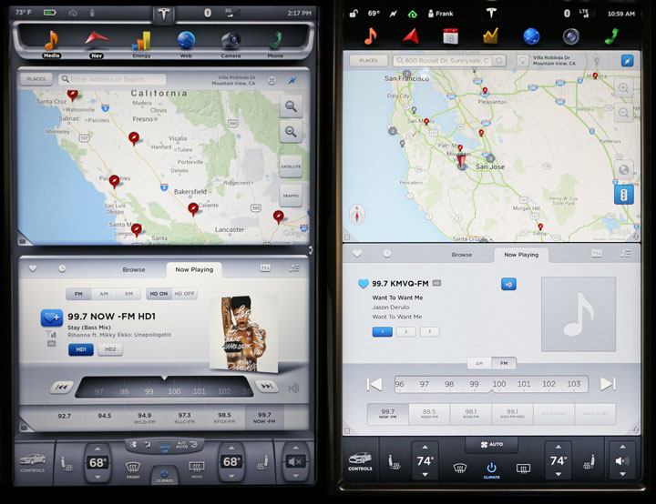
Version 5.x <—> Version 7.0
Here’s our analysis of the most notable UI changes:
- Top status bar – Far higher contrast with a darker background. Added new unlock doors button, replaced the battery state icon with charging icon. Overall a definite improvement.
- Selection bar – Higher contrast, but lost the floating 3D shadows, app names and identification of which app is selected. Icons style improved slightly for clarity. Overall better for existing users, but may be less clear for new owners. Probably a good tradeoff.
- Nav – Now about 15% larger area with more width and height. Note the top is translucent so you can get a partial view of another 10% or so. +/- zoom buttons are not as dark with a far clearer icon, which is better. Overall definitely better.
- Audio – Almost all the fonts are smaller and/or less bold making it a little harder to read. Scan buttons are no longer obvious they are buttons. Album art is slightly larger and no longer 3D. While we only show the radio app, other audio apps are similar. Overall less cluttered and cleaner, but lost any excitement in style.
- Climate bar – Higher contrast for everything and flat style makes it harder to pick out the most important information such as temperature setting. Tesla removed the fan and recirculation status icons. The front/rear text under defrost buttons was also removed. Oddly in bright sunlight, the new style seems to be harder to pick out buttons even though it should be better. Likely the best that could be done using a flat style. Similar to the radio, it feels more “GM” ordinary rather than offering any excitement in style.
Overall, it offers some pluses and minuses. If I had a choice in its entirety (i.e. can’t pick and choose) I feel the new 7.0 is better and a worthy upgrade. It may take some owners a bit of time to get used to it. I just hope Tesla can add back in a little more style excitement in future iterations. I expect we’ll have this UI for the next 2-3 years unless this is a test and 7.1 changes everything again.
Also of interest, our Instrument Panel 7.0 User Interface Evolution and Analysis.
3 comments
resolution:
i talked to tesla about th above and they couldnt explain it. but th upside is that if you select th power app using th right scroll wheel [after holding it down for ~1 sec] what was disappearing now comes up and stays. so im a happy camper..i have my power meter with regen!! 🙂
I’ve got a 70D and have noticed the following: When I’m in trip mode and shift into Drive I momentarily get what we are all looking for! It replaces the tabular data with an orange version of the v6 circular gauge with the >0 showing energy usage and the <0 showing regen! BUT it only stays up for a few seconds and reverts to the table. Have any of you seen this?
clarification- im talking about th dash display behind th steering wheel [often called th cluster display]. and in that screen im referring to th default right hand display that you can control with th right steering wheel scroll button. initially its a table summarizing energy usage with no info on regen.